 Back
Back[UX/UI, web]
Górna Półka: E-commerce & Configurator
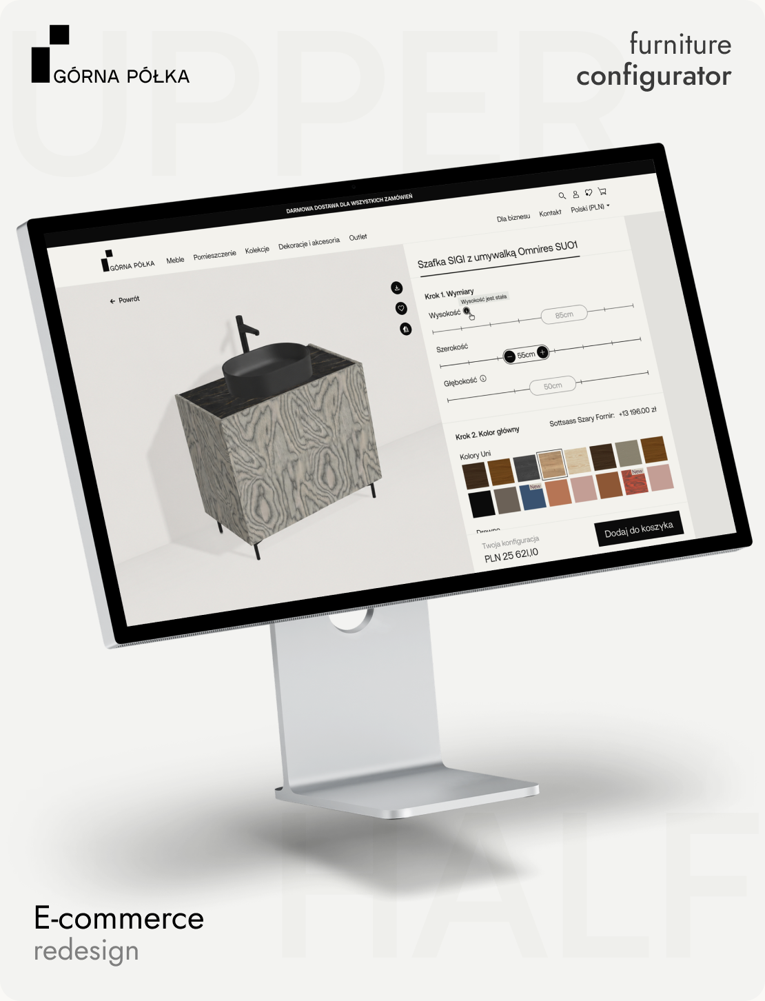
End-to-end redesign of a multi-market furniture e-commerce platform, including a step-based product configurator built to replace a static, one-size-fits-all product experience

Year
2024 - 2025
Role
Sole Product Designer
Scope
UX Research · IA · Design System · UI Design · Usability Testing
Type
E-commerce · B2C · Web
One catalog, two very different products
Górna Półka sells furniture with dozens of possible configurations — dimensions, materials, finishes, and colors.
Alongside fully configurable pieces, the catalog also includes simple products (rugs, posters, décor) with little to no customization. The existing product experience treated every item the same way, creating friction for complex purchases and unnecessary complexity for simple ones.
Core problem
Every product got treated the same — whether it needed one decision or twelve.
They were adding to cart without knowing what they'd get
To understand how customers actually used the old site, I reviewed session recordings and behavioral data in Microsoft Clarity. The catalog mixed furniture, accessories, and décor into undifferentiated categories, making it hard to browse with intent, and the underlying platform was reaching its limits — slow page speed and recurring bugs as the catalog grew.
Before
Categories mixed furniture, accessories, and décor together. The platform itself was reaching its limits — slow pages, recurring bugs.
After
Furniture, accessories, and décor split into clear categories, on a platform rebuilt to handle a growing catalog without breaking down.
Key finding
The product page never changed — no matter what the customer chose.
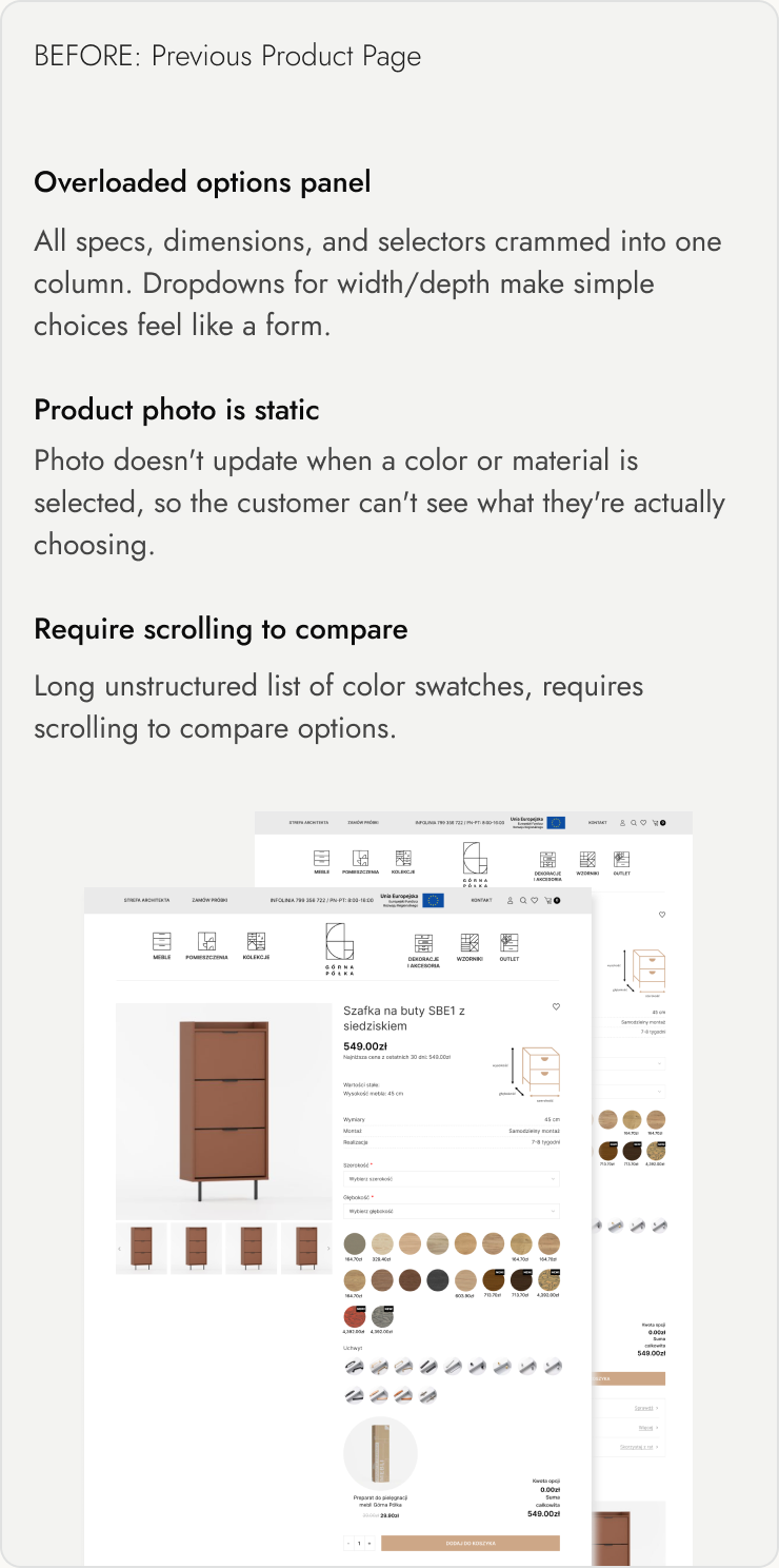

Not every product in the catalog needed the same level of complexity
I explored two ways to bring the configurator into the shopping experience.
Configurator as the product page
Opening a configurable product would take the customer directly into a full-screen configurator — no extra step, immediate customization. This worked well for complex products, but left simple products with no clear reason to be there.
Product page first, configurator when needed
Every product gets a standard product page. Complex products add one extra step to launch the configurator.
I chose consistency over removing one extra step: one extra click for configurable products, but a shopping experience that stays the same across the whole catalog.
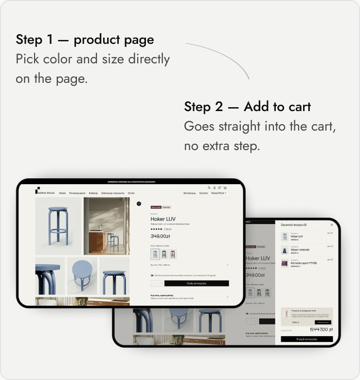
Flow 1 — Simple product flow
For products with a single option set — the customer picks color and size directly on the product page, no configuration needed.


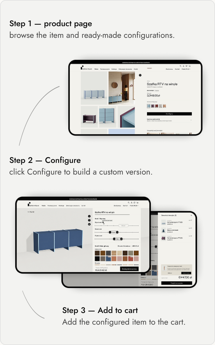
Flow 2 — Configurable product flow
For products with multiple variations — the customer builds their own version in a dedicated configurator before adding to cart.

A new brand needed a systemThe new brand identity had no rules for digital products — and the configurator was about to multiply every inconsistency
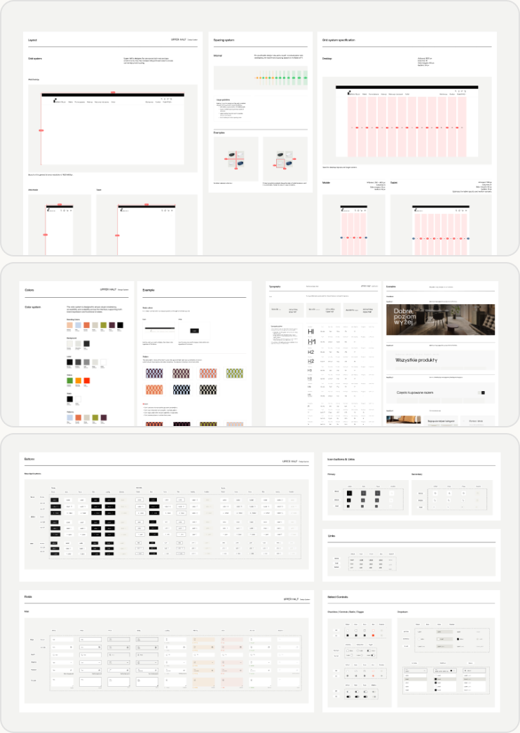
I translated the new brand identity into a documented system: a responsive grid and spacing scale, a color system with clear rules for backgrounds and brand patterns, and a typography scale built to support multilingual content across five markets. Buttons, links, form fields, and selection controls were standardized across every state, so new screens could be assembled from existing pieces instead of designed from scratch.
This system now powers the full product experience, including the step-based configurator — the same components and rules extended to five international markets without being rebuilt for each one.


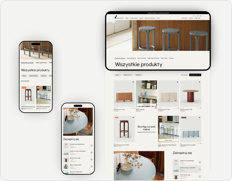
People don't buy one piece. They buy a look
This decision started with classifying the catalog by configuration complexity. I audited the product range and separated furniture from accessories and décor, which had previously been mixed together. I also introduced collection-based browsing alongside categories, reflecting how customers often return to the same collection for matching pieces.
Constraint
The structure had to change. The pages had to stay.
The legacy header exposed every category in one flat dropdown — long enough to run beyond the viewport, with little grouping or hierarchy. Many of those pages carried SEO value, so removing them during the Magento migration wasn’t an option.
Instead, I introduced a new navigation layer above the legacy taxonomy: a smaller set of logical groups that organized existing categories without deleting their underlying pages. Customers could now navigate this structure through the header or directly from the catalog, then use expanded filters to narrow down a large and complex product range.

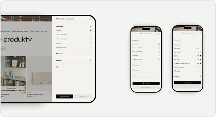
Quick when you need it. Detailed when you want it.
On desktop, each filter — sort, properties, materials, color — opens as a quick dropdown right where it is, for fast, single-facet changes. Opening ‘All filters’ brings up the full sidebar panel for browsing everything at once. On mobile, the same filters expand as independent accordion sections, so narrowing a catalog of hundreds down to what you want never means losing your place in a long list.

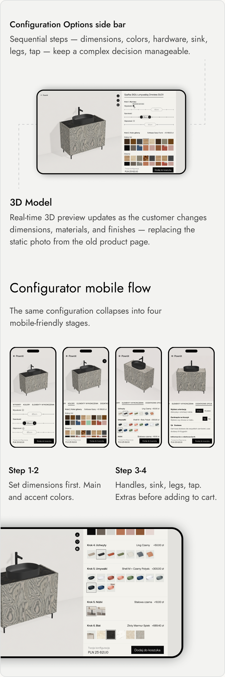
Step-based flow with a real-time visual preview
For configurable products, I designed a step-based flow with a real-time visual preview: customers adjust dimensions via sliders and see the piece update instantly in 3D, then move through material and color selection with the same live feedback. The price updates at each step, so customers always understand the cost of their choices before adding to cart.

One gesture, two expectations
Before the configurator went live, we observed how a small group of potential users interacted with it on a private staging link. One clear pattern emerged on mobile: users instinctively tried to pinch-zoom into the 3D preview. That gesture was already mapped to rotating the product — swiping left or right turned the model around its axis — so pinch-zoom had no effect, leaving users confused. Based on this finding, I added a dedicated zoom-in control, allowing users to inspect details without conflicting with the rotation gesture.
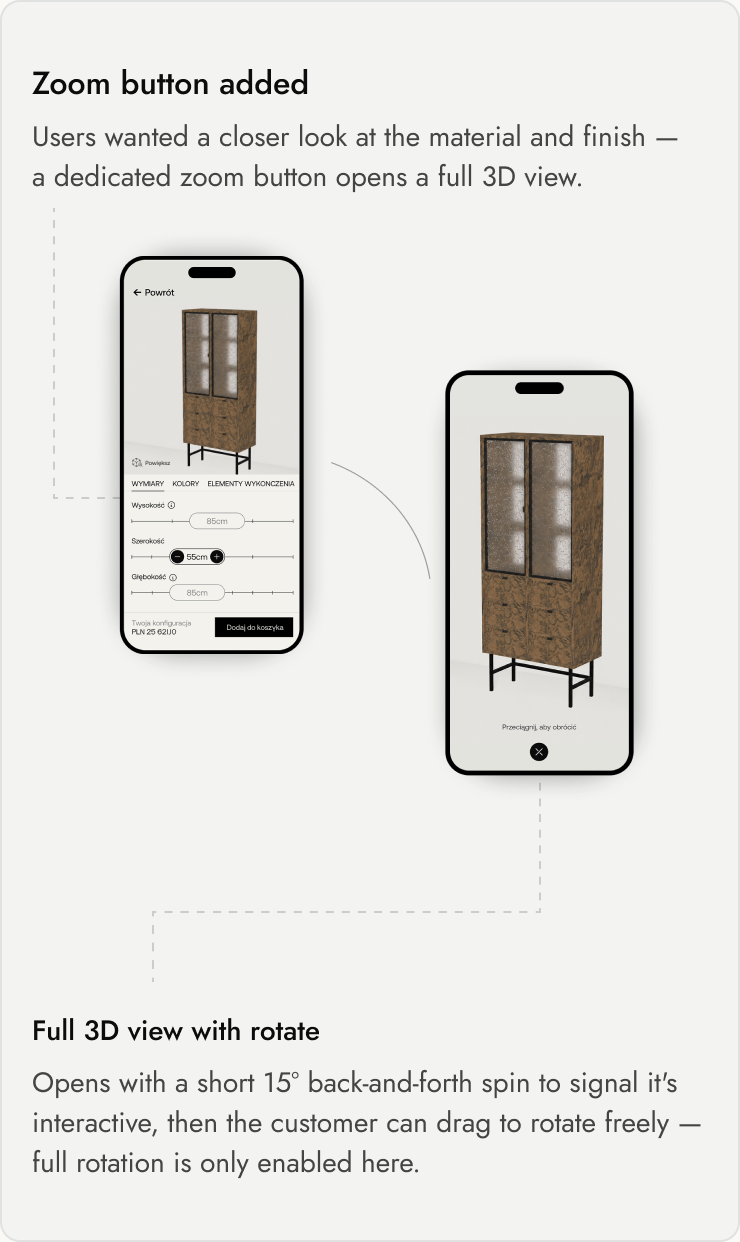

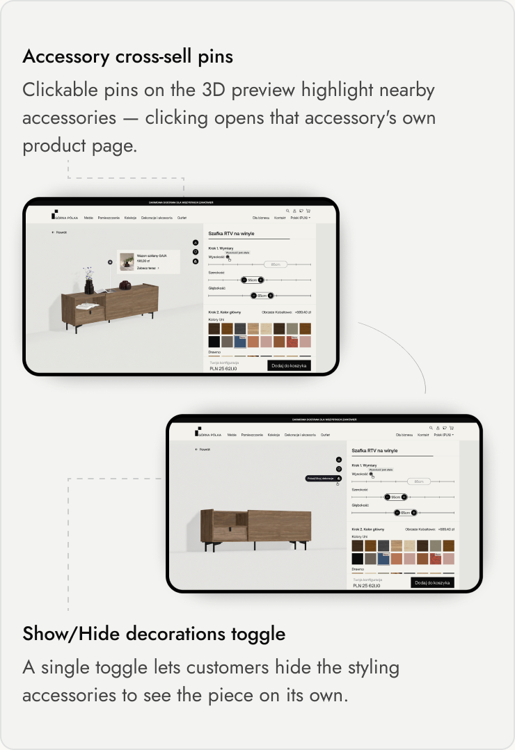
The same sessions surfaced a second issue: the clickable accessory pins on the 3D preview pulled attention away from the product itself while people were trying to configure it — even though the business needed to keep that cross-sell path. I added a show/hide toggle, so customers could dismiss the pins while configuring and bring them back when they wanted to browse accessories.

Same system, new market — no rebuild
With expansion into multiple markets planned, I designed the system for localization from the start, separating what’s reusable — layout, components, configurator logic — from what changes per market: language, currency, and payment and delivery options. That structure now powers localized versions across five additional markets — Czech, Slovak, German, French, and Romanian — without rebuilding the underlying system for each one.
A short window, a real number
Comparing the month before launch to the month after, the redesigned product experience showed an 18% increase in average time on page for the Polish market, alongside a noticeable drop in bounce rate on the same pages. This reflects a short pre/post comparison immediately following launch, prior to my departure from the company.
01
+18% Increase in average time on page
02
300+ Product categories the new catalog and IA supports
03
Scales to 5 new markets without a rebuild
Simplifying complexity means revealing it at the right moment
The biggest lesson from this project: simplifying a complex catalog isn’t about removing options — it’s about showing the right level of complexity at the right moment.
If I continued working on this product, I’d use post-launch behavior to validate and refine three areas:
Areas to validate
Product discovery
Are users finding the right products faster through the new filtering experience?
Configuration
Where do users hesitate, backtrack, or abandon the configuration flow?
Simple vs. configurable products
Does separating the two experiences actually help users decide with less friction?
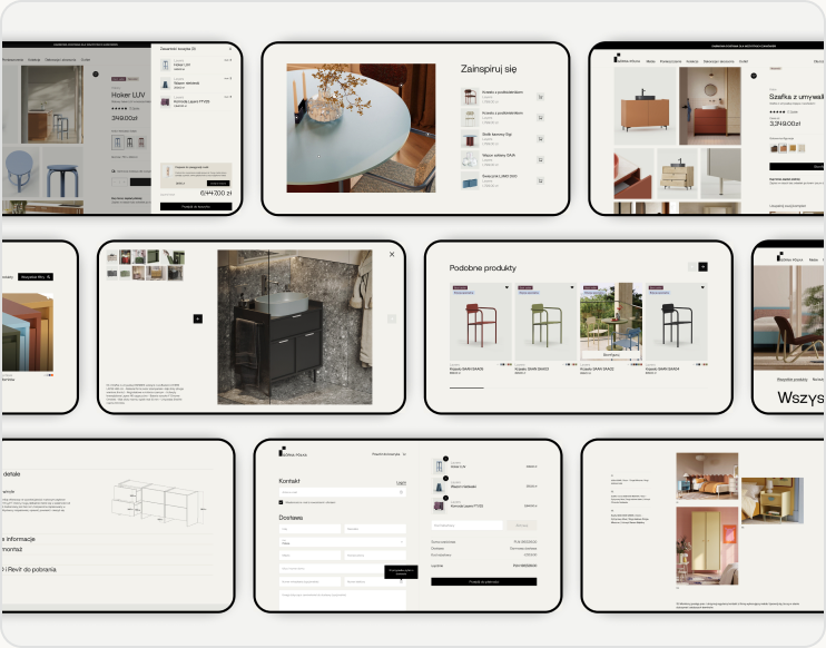
The same system, across the rest of the site.

next
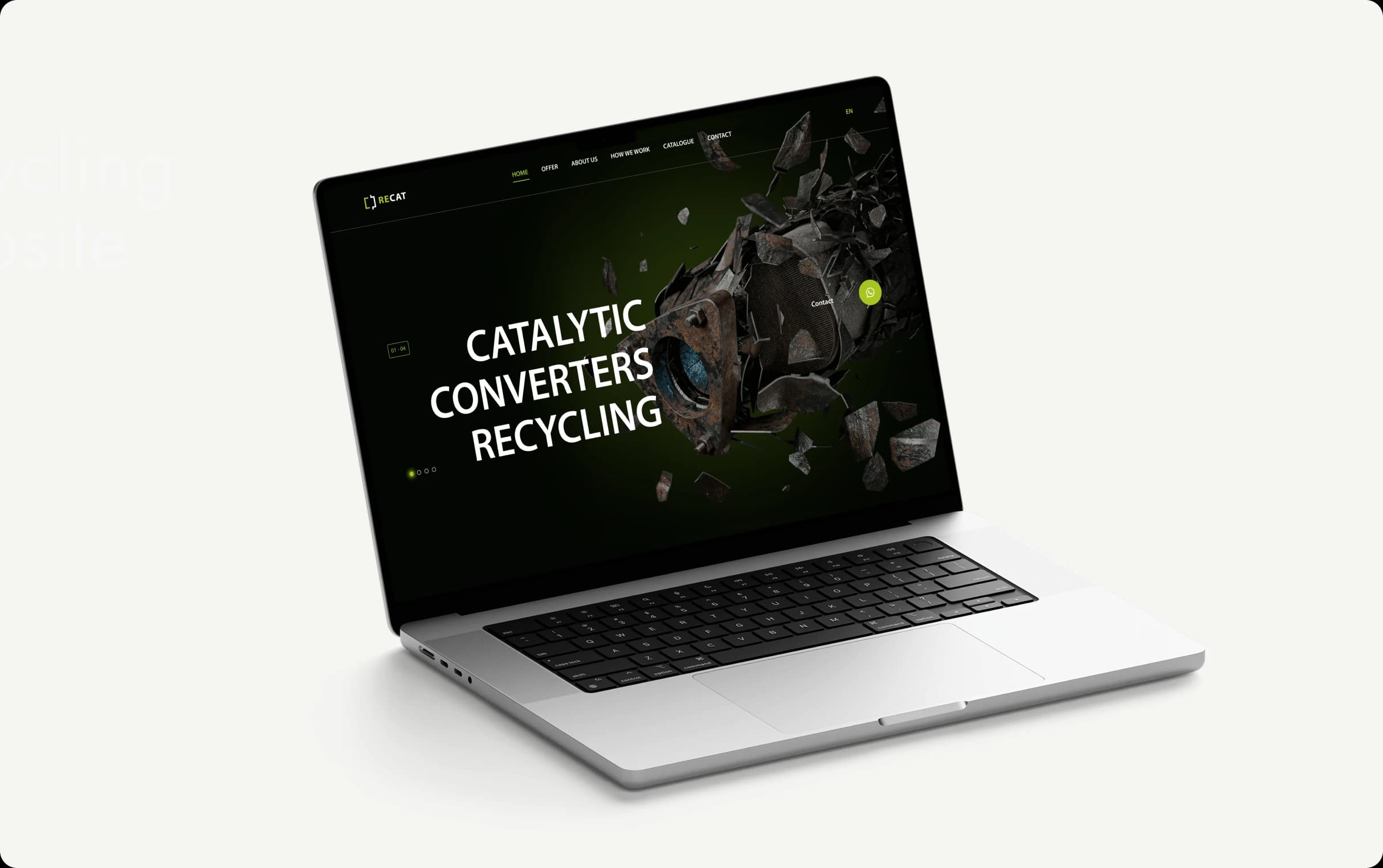
RECAT — Recycling Company Website
WhatsApp lead flow integrated with CRM for a technical B2B recycling service.
Previous
Medgal — Product Catalog & Information Architecture
Replaced a static PDF catalog with a searchable system for a large, technical product range.
next
RECAT — Recycling Company Website
WhatsApp lead flow integrated with CRM for a technical B2B recycling service.